Implementing and using Blocks
One of the most common use cases for customization in templates in the Front-end Framework is creating or replacing pages and components in an existing template. This guide will explain the general expected workflow for creating a component or page.
This is given as a general process as to how to approach this problem. This process is how we use the Front-end Framework internally, but you may approach this problem in any way that you see fit.
Example: Creating a profile page
Let us start with a simple use case: creating a profile page. This page will display the following info:
- Logged in user's name
- Logged in user's email
- Logged in user's phone number We must handle the behavior while the page is loading, as well as when the user is not logged in and tries to access the page.
Generally, the approach we suggest is to break this problem into a MVC pattern:
- Model: The data that we want to display, loaded from the backend
- View: The component that will display the data
- Controller: The logic that will handle the data loading and error handling
The Model is the simplest part of this problem. We will use the UserApi client
from @basaldev/blocks-frontend-sdk to load the user's data. This client provides
a getUser method that will return the user's data when they are logged in.
For the View, we will create a new component that will display the user's data.
For the Controller, we will create a new block that will handle the data loading and pass this information into the view.
Create a View Component
First, we will create a new component that will display the user's data. This component should not contain any business logic and should only be concerned with displaying the different states of the page.
As a rule of thumb, avoid using state inside of your views. Instead, see if you can use callbacks to pass data from the parent component, and use more concrete methods to handle state, such as query parameters, page navigation or local storage.
import {
  LoadingPage,
  ShowPage,
  Spacing,
  Typography,
} from '@basaldev/blocks-frontend-framework';

import classes from './ProfileView.module.css';

export interface ProfileViewProps {
  isLoading?: boolean;
  labels: {
    email: string;
    fallback: string;
    name: string;
    pageTitle: string;
    phoneNumber: string;
  };
  values: {
    email: string;
    name: string;
    phoneNumber: string;
  };
}

const DataRow = ({
  fallback,
  label,
  value,
}: {
  fallback: string;
  label: string;
  value: string;
}) => {
  let valueElement = (
    <Typography size="S" color="low-emphasis">
      {fallback}
    </Typography>
  );
  if (value) {
    valueElement = <Typography size="S">{value}</Typography>;
  }

  return (
    <Spacing
      direction="row"
      alignItems="center"
      className={classes.showPageItem}>
      <Typography size="S" weight="bold">
        {label}
      </Typography>
      {valueElement}
    </Spacing>
  );
};

export const ProfileView: React.FC<MyProfileProps> = ({
  labels,
  values,
  isLoading,
}) => {
  if (isLoading) {
    return <LoadingPage screenMode="desktop" />;
  }

  return (
    <ShowPage pageTitle={labels.pageTitle}>
      <Spacing direction="column" gapSize="none">
        <DataRow
          label={labels.name}
          value={values.name}
          fallback={labels.fallback}
        />
        <DataRow
          label={labels.email}
          value={values.email}
          fallback={labels.fallback}
        />
        <DataRow
          label={labels.phoneNumber}
          value={values.phoneNumber}
          fallback={labels.fallback}
        />
      </Spacing>
    </ShowPage>
  );
};
Notice that we define a DataRow component that will display a label and a value.
For this example, we avoided using too much of the design system to demonstrate
how you can create your own components.
For CSS styles, we recommend using CSS modules to avoid conflicts with other styles like so:
@import '@basaldev/blocks-frontend-framework/dist/style.css';

.showPageItem {
  box-sizing: border-box;
  width: 100%;
  padding: 16px;
  border-bottom: 1px solid var(--color-border-low-emphasis)
}

.showPageItem:first-child {
  border-top: 1px solid var(--color-border-low-emphasis);
}
The @import statement will import the design system's CSS, to ensure that your
application handles the theme correctly.
Lastly, create a Storybook story in order to test your component in isolation:
import type { Meta, StoryObj } from '@storybook/react';

import { ProfileView } from './ProfileView';

const meta: Meta<typeof ProfileView> = {
  component: ProfileView,
  parameters: {
    layout: 'fullscreen',
  },
  title: 'Views/ProfileView',
};

export default meta;
type Story = StoryObj<typeof ProfileView>;

export const Main: Story = {
  args: {
    labels: {
      email: 'メールアドレス',
      fallback: '未設定',
      name: '氏名',
      pageTitle: 'プロフィール',
      phoneNumber: '電話番号',
    },
    values: {
      email: 'test@basal.dev',
      name: '山田 太郎',
      phoneNumber: '090-1234-5678',
    },
  },
};

export const BlankValues: Story = {
  args: {
    labels: {
      email: 'メールアドレス',
      fallback: '未設定',
      name: '氏名',
      pageTitle: 'プロフィール',
      phoneNumber: '電話番号',
    },
    values: {
      email: '',
      name: '',
      phoneNumber: '',
    },
  },
};

export const Loading: Story = {
  args: {
    isLoading: true,
  },
};
Try opening your storybook and see if your component is rendering correctly.
Run yarn storybook to start the storybook server. If everything is working
as expected, you should be able to see a component that looks like the following:
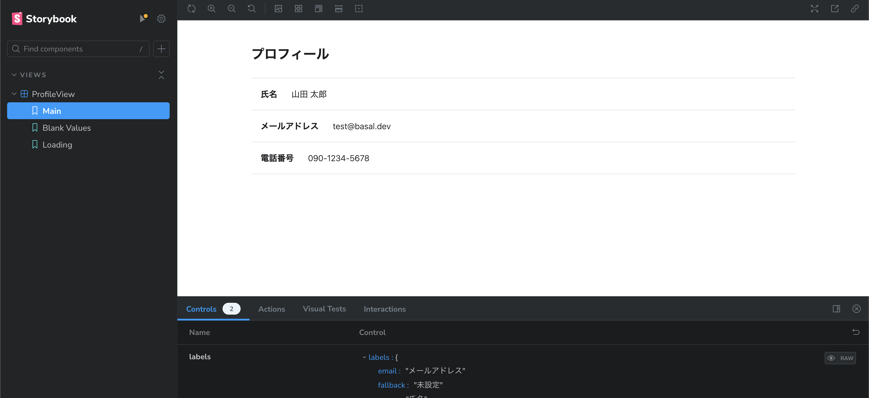
Try using the menu to switch between the different stories to see if the component is rendering correctly in when it is loading, when it has data, and when it has incomplete data.
Create a Block
Next, we will create a block that will handle the data loading and pass this
information into the view. This block will use the UserApi client to load the
user's data and pass it into the view.
import {
  BlockComponentProps,
  PaymentPage,
  useApiGet,
  useTranslation,
} from '@basaldev/blocks-frontend-framework';

import { NBError, ErrorCode, api } from '@basaldev/blocks-frontend-sdk';

import { ProfileView } from './ProfileView';

export interface MyProfileOptions {
  /** UserAPI client */
  userApi: Pick<api.UserApi, 'getUser'>;
}

/**
 * Creates a page that displays the logged in user's profile information
 */
export const createMyProfile = ({ userApi }: MyProfileOptions) => {
  const MyProfile: React.FC<BlockComponentProps> = (blockProps) => {
    const { t } = useTranslation();
    const { sessionState } = blockProps;
    if (!sessionState.userId) {
      throw new NBError({
        code: ErrorCode.internalServerError,
        message: 'User Id ID missing',
      });
    }

    const [{ data, loading }] = useApiGet(
      userApi.getUser.bind(userApi),
      sessionState.userId
    );

    return (
      <ProfileView
        labels={{
          email: t('MyProfile:email'),
          fallback: t('MyProfile:fallback'),
          name: t('MyProfile:name'),
          pageTitle: t('MyProfile:pageTitle'),
          phoneNumber: t('MyProfile:phoneNumber'),
        }}
        values={{
          email: data?.email || '',
          name: data?.name || '',
          phoneNumber: data?.phoneNumber || '',
        }}
        isLoading={!data && loading}
      />
    );
  };

  return MyProfile;
};
There are a few things to notice in this block:
- The block itself is a function that returns a React component. This is a common
pattern in the Front-end Framework, as it allows for configuration and dependencies
to be 'injected' into the block at startup. In this case, we are injecting the
UserApiclient. - The block uses the
useApiGethook to load the user's data. This hook triggers an async request to thegetUsermethod of theUserApiclient, and returns the data and loading state. We provideuseApiGetanduseApiMutationhooks as convenience methods to handle API requests in the Front-end Framework to connect api clients to React's state management. - The block uses the
useTranslationhook to load the translations for the page. This is provided byi18next'sreact-i18nextpackage, and is used to load translations for the page based on the current language. - The current userId is loaded from
blockProps.sessionState.userId. This is one of the standard properties that is passed to all blocks in the Front-end Framework, and is used to determine the current user's ID.
For the full list of props passed to the block, see the BlockComponentProps interface
in the Front-end Framework package.
In addition, we need to add translations for the page. This can be done by adding
them to a translationOverrides.yaml file:
ja:
  MyProfile:
    email: メールアドレス
    fallback: 未設定
    name: 氏名
    pageTitle: プロフィール
    phoneNumber: 電話番号
This can then be imported as an override in the template configuration. See the Customizing Text guide for more information.
If desired, you can create a Storybook story for this block as well to test it in isolation. This is especially useful if you want to test the block's behavior with mocked data, or implement mocked delays to test the loading state.
Configuring a template block page
To use this block, it must be added to the Front-end Framework template. This is done by adding a new block page entry in the template configuration.
import { isLoggedIn } from '@basaldev/blocks-frontend-framework';
import { createMyProfile } from './MyProfileBlock';

{
  ...
  blockPages: [
    ...,
    {
      component: createMyProfile({ userApi: dependencies.userApi }),
      name: 'my_profile',
      pageTitle: (t) => t('MyProfile:pageTitle'),
      path: '/my-profile',
      validators: {
        isLoggedIn: isLoggedIn({
          notLoggedInRedirect: 'auth.login',
        }),
      },
    },
  ]
}
In this configuration, we are adding a new block page with the name my_profile
and the path /my-profile. This block page will use the createMyProfile block
to render the page, and will redirect the user to the auth.login page if they
are not logged in.
To handle the redirect, we use the isLoggedIn validator from the Front-end Framework.
Validators are functions that are run before the block page is rendered, and can be
used similarly to Back-end validators to handle common use cases like checking if
the user is logged in, whether they have the correct permissions, etc.
With this configuration, the user should be able to access the /my-profile page
and see their profile information when they are logged in. Try navigating to this
page in your application to see if it is working as expected!
For more information on how to configure block pages, see the blockPages property
on the Configure a Template
guide.
Sidebars and Menus
Block pages are not the only types of blocks supported by the Front-end Framework. When using the default Navigation component, you can also add blocks to the side navigation and top-right menu.
In a typical use case, you might want to add a link to the profile page in the sidebar. We provide a default block that handles most common static use cases:
{
  navigationComponent: createNavigation({
    ...
    sideNavigationBlocks: [
      createSideNavigationItemDefault({
        icon: 'profile',
        requiresLogin: true,
        text: (t) => t('MyProfile:pageTitle'),
        toRoute: 'my_profile',
      }),
    ]
  }),
}
This configuration will add a link to the profile page in the sidebar. The requiresLogin
property will ensure that the link is only shown when the user is logged in.
Sometimes, you will want to implement a sidebar component that is more complex than just displaying a static string. In this case, you can create a custom sidebar block. For example, here is the implementation of a block that displays the user's name:
export interface SideNavigationItemUserInfoOptions {
  /** Route to link to when clicked */
  toRoute: string;
  /** User api */
  userApi: Pick<api.UserApi, 'getUser'>;
}

/**
 * A side navigation item that loads and displays info about the currently logged in user's name
 * as a header
 */
export const createSideNavigationItemUserInfo = (
  options: SideNavigationItemUserInfoOptions
) => {
  const { toRoute, userApi } = options;
  const SideNavigationItemUserInfo: React.FC<BlockComponentProps> = ({
    onNavigate,
    sessionState,
    urlForRoute,
  }) => {
    const href = urlForRoute(toRoute);
    const [{ data: userData }] = useApiGet(
      userApi.getUser.bind(userApi),
      sessionState.userId ?? '',
      { skip: !sessionState.isLoggedIn }
    );

    if (!userData) {
      return null;
    }

    return (
      <SideNavigationItem
        key="user-info"
        href={href}
        icon="person"
        onNavigate={onNavigate}
        text={userData.name}
        isHeader
      />
    );
  };

  return SideNavigationItemUserInfo;
};
Usage:
{
  navigationComponent: createNavigation({
    ...
    sideNavigationBlocks: [
      createSideNavigationItemUserInfo({
        toRoute: 'my_profile',
        userApi: dependencies.userApi,
      }),
    ]
  }),
}
This is a more complex block that loads the user's data and displays their name,
displaying nothing until the data is loaded. Note that we use the SideNavigationItem
design system component as a display. Views are not limited to being a full page,
but can be used as components in other locations as well.
SideNavigationItemUserInfo is actually one of the blocks provided by the Front-end Framework, and can be imported rather than created from scratch.
Menus are similar to the side navigation, but are displayed in the top-right corner of the screen.
Wizards and other utility blocks
In addition to the standard block types, the Front-end Framework also provides utility blocks that can be used to create more complex interactions without writing custom components.
Wizard
Take a look at the following example:
interface ExampleFormData {
  name: string;
  email: string;
  phoneNumber: string;
}

...

{
  ...
  blockPages: [
    {
      component: createWizard<ExampleFormData>({
        pages: [
          {
            component: createExamplePageOne({ ... }),
            key: 'my-page-1',
          },
          {
            component: createExamplePageTwo({ ... }),
            key: 'my-page-2',
          },
          {
            component: createExampleWizardSubmit({
              ...
            }),
            key: 'submit',
          },
        ],
        wizardCompleteRoute: 'after.wizard',
      }),
      name: 'example_wizard',
      pageTitle: (t) => // ...
      path: '/example-wizard',
    }
  ]
},
In this example, we are creating a wizard that has two pages and a submit page.
The wizard will navigate to the after.wizard route when the user completes the
wizard.
Each sub-page of the wizard is a block that can be created using the same pattern as any other block, but also receives additional props from the wizard:
blockProps: The standard props passed to the blockcurrentPageKey: The key of the current page opened in the wizardcurrentSubPageKey: The key of the current sub-page opened in the wizard (see sub-pages below)onSubPagesUpdated: A callback to set the sub-pages for the current pageonBack: A callback to go back to the previous pageonSkipOver: A callback to skip the current page and go to the next pageonSubmit: A callback to submit the current page and go to the next pageprogress: Information about the current progress in the wizardwizardFormState: The current form state of the wizard
Form State
The wizard will retain the form state across pages, and will pass the form state
into every page until onSubmit is called for the final page. This allows you to
have pages dynamically update based on the user's input in previous pages.
Form state for the wizard is saved into local storage until final submission, so
the user can navigate away from the wizard or refresh the page and return to the
same state. This allows for a more seamless user experience.
State is saved under the nodeblocksWizard:<name> key.
onSkipOver
The onSkipOver callback is used to skip the current page and go to the next page.
However, note that this marks the page is being 'ignored' in the wizard's progress,
and also calling onBack will not return to the skipped page.
You can use this property to skip pages that should not be ignored based
on the input on previous pages.
Sub-pages
Sub-pages are a way to create more complex interactions within a single page of
the wizard. For example, if you have a page where the user can select multiple
categories, and then a series of sub pages for every selected category, this
can be implemented by calling onSubPagesUpdated with the sub-pages for the
current page. The wizard progress will be updated to reflect the increased count
of page.
The list of sub-pages is also saved in local storage, so after being set, the wizard will remember which pages were configured to be shown.
Submitting without a final page
If you want to submit the wizard without a final confirmation page, you can implement the final page in an automated way. For example, you can implement a page with no content that automatically submits the wizard when it is opened.
Redirect
The redirect block is a simple block that will redirect the user to a different page when it is rendered. This can be useful for creating simple redirects in the template.
{
  ...
  blockPages: [
    {
      component: createRedirect({
        to: 'my_profile',
      }),
      name: 'redirect_to_profile',
      path: '/',
    }
  ]
},
Sections
The sections block is a simple block that will render a vertically joined list of other blocks. This can be useful for creating a page that is composed of multiple blocks.
{
  ...
  blockPages: [
    {
      component: createSections({
        components: [
          createMyProfile({ ... }),
          createExamplePageOne({ ... }),
        ],
      }),
      name: 'sections',
      path: '/sections',
    }
  ]
}
Dummy
The dummy block is a simple block that will render some sample text. This can be useful for creating a placeholder block in the template during development.
{
  ...
  blockPages: [
    {
      component: createDummy({
        text: 'This is a dummy block',
      }),
      name: 'dummy',
      path: '/dummy',
    }
  ]
}